Why the Blood Level Graph Doesn't Match How You Feel on a GLP-1
When I started retatrutide, I watched the blood level chart constantly. Almost a year in, I look at it way less, and that's because of what it taught me, not because it stopped mattering. Here is what changed, and why the graph is worth a lot less, and a lot more, than most people give it credit for.
By Jason Jeffries · August 25, 2026
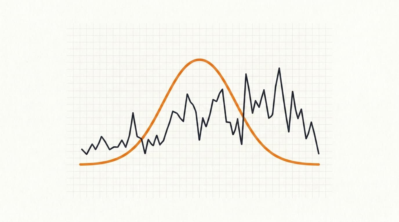
When I first started retatrutide, I watched the blood level chart constantly.
I made a short video walking through this same idea. Watch it on YouTube.
I was using it for two things. The first was timing my shot so the highest concentration landed while I was asleep, so I’d sleep through the worst of the side effects instead of feeling them at my desk. The second was watching where my level sat on the curve when my appetite started to come back. Once I could see that, I could start making a real decision about how often to inject. Every six days, every four, every three.
Almost a year in, I look at it way less than I used to, and that’s because of what it taught me, not because it stopped mattering. Here is what changed, and why I think the graph is worth a lot less, and a lot more, than most people give it credit for.
The graph tracked me well, until it didn’t
Once I was at a stable dose, the curve tracked my appetite pretty well. My hunger would come back around the same point on the line week to week, and I could plan around it.
While I was still titrating up, not so much. Every time the dose changed, the pattern moved, and the smooth line in the app was not telling me much about how the next few days would actually feel.
Then the longer thing happened. The more time I spent on it, the shorter the gap between shots where I felt suppressed became, so I kept tightening my interval. And now, on six milligrams a week for the last sixteen weeks, I honestly can’t tell the difference between the day after my shot and two days after. I’m suppressed pretty flat across the whole week.
I'm suppressed pretty flat across the whole week.
So the chart did its most important work in the messy middle, when I was learning my own rhythm. Once it taught me that, I didn’t need to study it every day.
Why your appetite doesn’t follow the line
A lot of people get thrown by this. You can be staring at a graph that says you’re at peak suppression while your stomach is telling you to raid the fridge.
Those charts are estimates. Every app that draws a blood level curve, mine included, is taking the compound’s half-life and drawing the line an average person would have. It does not know your absorption. It does not know how fast you clear the drug. And peaks and troughs are genuinely different for each of us, because we all metabolize these compounds differently.
On top of that, appetite was never a clean readout of your blood level in the first place. How hungry you are on a given day moves with your sleep, your carbs, how hard you trained, and where you are in your titration. The drug level is one input. It is not the whole story. So a smooth curve can say “high” while your actual hunger is doing its own thing that afternoon.
That’s why the guy who feels random suppression, hungry the day after his shot one week and fine the next, isn’t broken and isn’t doing anything wrong. He’s early, probably still adjusting his dose, and he’s expecting a population estimate to predict his individual body day by day. It can’t.
How my app actually builds that curve
I’ll show you what’s under the hood, because it’s the whole reason I keep calling it an estimate.
The chart uses a standard pharmacokinetic model. Pharmacokinetics is just the study of how a drug moves through your body: how fast it gets absorbed after the shot, and how fast you clear it back out. Plot those two rates over time and you get a shape called a Bateman curve, a line that climbs as the drug absorbs, peaks, then falls as it clears. That is the rise and fall you see in the app for one shot. It then stacks every past shot on top to show where you sit today.
The half-lives I use come straight from the drug labels and trial data:
- Semaglutide, about 7 days
- Tirzepatide, about 5 days
- Retatrutide, about 6 days (from the phase 2 trial data, since it isn’t approved yet, so I flag it as an estimate right in the app)
The catch is those numbers are population averages. A label’s half-life is the middle of a range measured across a lot of people, and your body is not the average of that range. Same goes for how fast you absorb it. So the curve I draw is the average person’s curve, scaled to your dose. It’s a good starting shape. It is not a reading of your blood.
I also don’t dress it up as a lab value. The line is “active drug in your body,” not a serum concentration, because nobody at home is drawing blood to measure their GLP-1 level. It’s there to show you the shape of the rise and fall so you can line your own experience up against it.
Use it the way you use every other tracker
I don’t think any of these trackers are deadly accurate. Not the blood level charts, not sleep scores, not body fat readings off a scale. None of them.
What makes them useful anyway is that they’re consistently inaccurate. The same estimate, off in the same direction, over and over. And once something is wrong in a consistent way, you can use it to measure your own experience even if the absolute number is fiction.
So this is what I’d actually do, and what I wish I’d understood on day one. Don’t chase the number on the curve. Track when your appetite comes back between injections, and see whether it lines up on the chart at the same spot week to week. Once it does, you’ve found your own timeline, and that’s the thing you can build your dosing schedule around. The chart stops being a prediction of how you should feel and becomes a ruler you check your real experience against.
The short version
The graph was a great teacher when I was learning to time my shots. It was a bad oracle whenever I expected it to tell me exactly how a given day would feel. It’s an estimate built for an average person, and you are not the average person.
Use it to spot your pattern, not to argue with your own hunger. Once it teaches you your rhythm, you might find, like I did, that you check it less because it already did its job.
Frequently asked
How long does retatrutide stay in your system?
The half-life is about 6 days, so it takes roughly five weeks of weekly dosing to reach a steady level, and after your last shot it takes a few weeks to mostly clear. Tirzepatide runs about 5 days, semaglutide about 7.
Why does my appetite come back before my next shot?
Usually one of two things. You’re still titrating, so your level and your tolerance are both moving, or you’ve been on long enough that your current dose doesn’t carry the full week anymore. Both are normal, and both are a signal about timing or dose, not a sign the drug quit working.
Why is my appetite suppression different every week?
Because appetite isn’t a direct readout of your drug level. Sleep, carbs, training, stress, and where you are in your titration all move it. The graph only tracks the drug. It can’t see the rest.
Should I inject more often if my appetite comes back early?
That’s a conversation for whoever prescribes for you, not something to freelance off a chart. What the chart is good for is spotting the pattern, when in the week it tends to come back, so you walk into that conversation with a real observation instead of a guess.
Are the blood level graphs accurate?
They’re estimates built on population averages, so treat the exact number as fiction. What they’re good for is consistency. The same estimate, wrong in the same direction every week, is still a useful ruler for tracking your own trend.
As always, none of this is medical advice, and if something feels off, an elevated resting heart rate that won’t settle, symptoms that scare you, talk to whoever prescribes for you. The chart is a tool for learning your timing, not a substitute for paying attention to your body.

Written by
Jason Jeffries
Founder of Frontload. Data analytics by day (12 yrs), training for 20, juggling a full-time job, family, and app development. I run TRT and peptides myself, and I built Frontload because my whole tracking system was a notebook in a drawer in my bathroom. I’m not a doctor and none of this is medical advice.
FRONTLOAD
Track it instead of guessing.
Doses, bloodwork, and an AI coach grounded in your own data — free to start, on the App Store and Google Play.